


Dashboards are powerful data visualization tools that allow users to quickly and easily understand complex information at a glance and help them gain insights. Whether you’re a business analyst, a project manager, or simply someone who needs to stay on top of key metrics, having effective interactive dashboards that provides actionable insights can make all the difference.
In this blog post, we’ll explore some real-world dashboard examples across different industries and use cases. From sales performance tracking to website analytics, you’ll get a comprehensive overview of how dashboards can be used for informed decision-making.
By the end, you’ll have a better understanding of the key components and best practices for designing dashboards that deliver maximum impact. Let’s dive in!
What is a Dashboard?

A dashboard is a visual display of the most important information needed to achieve objectives, consolidated and arranged on a single screen so the information can be monitored at a glance.
Business intelligence dashboards facilitate insights into significant metrics, from financial trends to operational efficiencies, allowing businesses to make informed strategies.
Dashboards typically aggregate and display key performance indicators (KPIs), metrics, and other data points to provide a comprehensive overview of a business, team, or process.
Some common features of dashboards include:
- KPIs and metrics: Quantitative measures that track progress toward specific goals
- Data visualizations: Charts, graphs, and other visual representations of data.
- Alerts and notifications: Indicators that highlight important changes or events.
- Drill-down capabilities: The ability to explore data in more detail by clicking on specific elements.
- Real-time insights : Information that is continuously updated to reflect the latest developments.
Types of Dashboard
Some common types of business dashboards include:
- Operational Dashboards: These dashboards provide real-time data and metrics that help in the day-to-day operations of a business.
- Strategic Dashboards: These are used by senior executives to monitor the long-term company strategies and key performance indicators (KPIs).
- Analytical Dashboards: These dashboards are designed for data analysts to explore large volumes of data and uncover insights.
- Tactical Dashboards: These are used by mid-level management to track performance and progress towards specific goals.
To simplify the dashboard creation process and address challenges related to data overload, you can refer to various business dashboard examples that showcase practical templates and curated reporting ideas.
Dashboard Examples
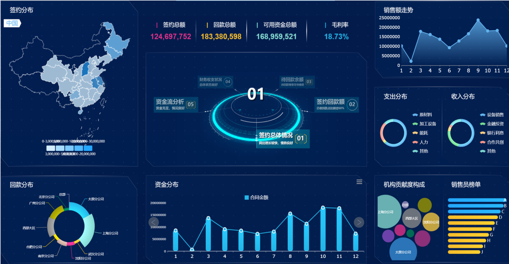
1. Sales Dashboard:

A sales dashboard tracks sales-related data, such as
- revenue,
- pipeline,
- lead generation, and
- customer acquisition,
helping sales teams monitor their performance and make data-driven decisions. Common metrics include:
- total sales,
- sales by product or region,
- conversion rates, and
- average deal size.
Sales dashboards often integrate data from various sources, including customer relationship management (CRM) systems, marketing platforms, and financial software. This consolidation provides a comprehensive view of the sales process, from initial lead generation to closed deals, and allows for efficient monitoring of key financial metrics.
2. Marketing Dashboard:

A marketing dashboard focuses on metrics related to digital marketing campaigns, website analytics, website traffic, social media engagement, and lead generation, enabling marketers to measure the effectiveness of their strategies. Customer satisfaction can also be tracked and improved through these analytics tools, leading to enhanced business growth and client retention.
These dashboards typically include key performance indicators (KPIs) such as:
- conversion rates,
- click-through rates,
- cost per acquisition, and
- return on investment (ROI)

By visualising this data, marketing teams can quickly identify trends, spot areas for improvement, and make data-driven decisions based of different campaign performance.
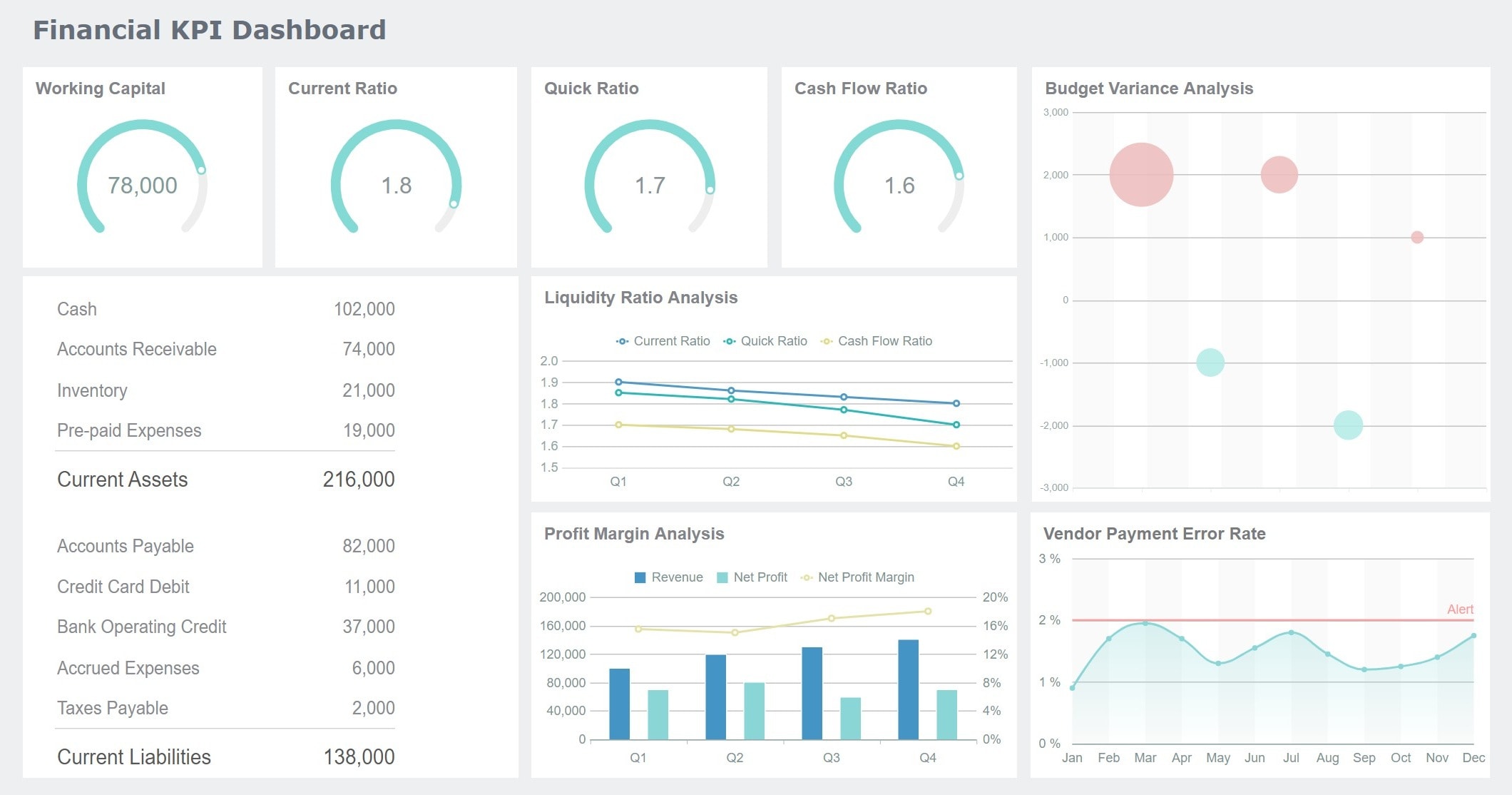
3. Financial Dashboard:

A financial dashboard consolidates financial data, including
- profit and loss statements,
- cash flow, and
- budget management,
providing finance teams with a centralized view of the organization’s financial health.
By integrating data from various sources, such as accounting software, CRM systems, and sales platforms, these dashboards offer a holistic view of financial performance across different departments and business units.
Dashboard templates can serve as essential tools for creating effective financial dashboards, helping users customize data visualizations to meet the specific needs of their organization.
4. HR Dashboard:

An HR dashboard tracks employee-related data, such as
- headcount,
- retention rates,
- training, and
- performance metrics,
assisting HR teams in workforce planning and optimization.
These dashboards often include visual representations like charts and graphs, making complex data easily digestible.
Common features include
- turnover analysis,
- recruitment funnel tracking, and
- employee engagement scores.
By centralizing this information, HR professionals can quickly identify trends, address potential issues, and align HR strategies with overall business objectives. Users can also try out these dashboards with their own data to see how well they can present and analyze metrics specific to their organization.
5. Operations Dashboard:

An operations dashboard provides visibility into the organization’s day-to-day activities, including production metrics,
- inventory levels, and
- supply chain data,
- helping operational teams identify bottlenecks and
- optimize processes through data analytics.
Key performance indicators (KPIs) are typically displayed in easy-to-read charts, graphs, and tables, allowing for instant analysis of critical business metrics. The dashboard can also incorporate alerts and notifications for when certain thresholds are reached, prompting immediate action.
Best Practices for Dashboard Design
Designing an effective dashboard requires following certain best practices to ensure the data is presented in a clear, intuitive, and actionable manner.
Some key best practices for dashboard design include:
- Identify key metrics: Determine the most important metrics and KPIs that users need to track.
- Organize data logically: Group related metrics together and arrange them in a way that makes the most sense for your users.
- Use visuals effectively: Select chart types that best represent the data. Leverage color, size, and other visual cues to highlight important information.
- Ensure readability: Use a clean, uncluttered layout with ample white space. Choose an appropriate font size and style for easy reading.
- Make it interactive: Allow users to filter, sort, and drill down into the data as needed to get deeper insights.
- Optimize for the viewing device: Design the dashboard with the right screen size and resolution in mind, whether it's desktop, tablet, or mobile.
Sprinkle Data - The Best BI Tool for Powerful Business Intelligence Dashboards
When it comes to business intelligence (BI) tools, Sprinkle Data stands out as a top choice for creating visually stunning and informative dashboards. With its robust set of features, Sprinkle Data empowers users to transform raw data into meaningful insights.
With Sprinkle Data users can easily create a wide range of chart types, from bar graphs and pie charts to more complex visualizations like scatter plots and heatmaps. The tool's intuitive interface makes it simple to customize the appearance and layout of these visualizations, ensuring that the final dashboard is not only informative but also visually appealing.
One of the standout features of Sprinkle Data is its ability to handle data from a variety of sources. Whether you're working with spreadsheets, databases, or cloud-based data warehouses, Sprinkle Data can seamlessly connect to and integrate your data, providing a unified view of your business metrics.
Sprinkle Data's comprehensive set of features, user-friendly interface, and commitment to data security make it an excellent choice for businesses seeking a powerful BI tool for their dashboarding needs.
Frequently Asked Questions- FAQs- Example of Dashboard
What is dashboard with example?
A dashboard is a visual display of the most important information needed to achieve one or more objectives, consolidated and arranged on a single screen so the information can be monitored at a glance.
What is an example of sales dashboard?
An example of a good sales dashboard is one used by a sales team to track key metrics like revenue, sales pipeline, and customer churn.
What are the three types of dashboards?
The three main types of dashboards are:
- Strategic dashboards to monitor high-level organizational goals
- Analytical dashboards to analyze trends and performance data
- Operational dashboards to track daily business activities and processes
What is a digital dashboard example?
A digital dashboard is an example of a dashboard that is accessed and viewed on a computer, tablet, or mobile device, rather than a physical display.
How to create a dashboard?
To create a dashboard, you need to identify the key metrics and data to track, organize the information in a clear and visually appealing layout, and ensure to use an effective BI tool like Sprinkle Data.
What is a successful dashboard?
A successful dashboard is one that provides the right information to the right people at the right time, enabling them to make informed decisions.
How do you present a good dashboard?
To present a good dashboard, use clear and concise visualization techniques, group related metrics together, and ensure the layout is intuitive and easy to interpret.
What is a quality dashboard?
A quality dashboard is one that is accurate, timely, and actionable, allowing users to quickly understand the information and take appropriate actions.
What is the most important thing in a dashboard?
The most important thing in a dashboard is to focus on the key performance indicators (KPIs) that are critical to the business or organization.
What is KPI and dashboard?
KPIs are the metrics used to quantify the achievement of specific goals, and dashboards are the visual tools used to track and monitor these KPIs.
What are dashboard items?
Dashboard items are the individual metrics, charts, and visualizations that make up the overall dashboard.
What is the main purpose of dashboard?
The main purpose of a dashboard is to provide a centralized, at-a-glance view of key performance indicators relevant to a particular objective or business process.


